Technical Blog 3
What is a responsive site, and why is responsiveness important?
A responsive site is a site which has used the@mediarule to establish limitations to the content displayed on a page depending on a range of factors including page orientation and screen resolution. Page responsiveness is extremely important to functionality and display, as a site that is not designed to change with different screen sizes isn't an interactive and pleasant experience for users.What's mobile design, and why is it important?
Mobile design is design that is designed for a 400px screen or less, which is the average width of a browser used on a phone, and it's important because it allows the optimisation of a page on the screen of a phone. It will allow for some elements of a page to rearrange, flex, move or disappear completely, allowing for the most important of information to take precedence on the page.What are frameworks, and what are their pros and cons?
Frameworks are set tools or templates that are created to help developers build their own sites and help them to find certain things in pre-existing frameworks that they like and that they can adopt for their own material. A big pro of this is that it saves a massive amount of time in writing lots and lots of code, which can sometimes get a little tedious, and also take a lot of time out of looking for bugs or missing tags that you would sometimes expect when writing all of your code from scratch. However, a con of using a pre-existing framework is that you miss out on a lot of experience in writing your own code, and sometime you might miss small lines of code that you might not fully understand or know how to implement yourself.What is a wireframe, and why do we use it?
A wireframe is a very basic visual representation or sketch of elements on a website without any smaller details like font, colors, shading or other design elements. A wireframe is a great way to put forward or pitch ideas to yourself or to others about the overall vision of your page, and where everything is going to go.
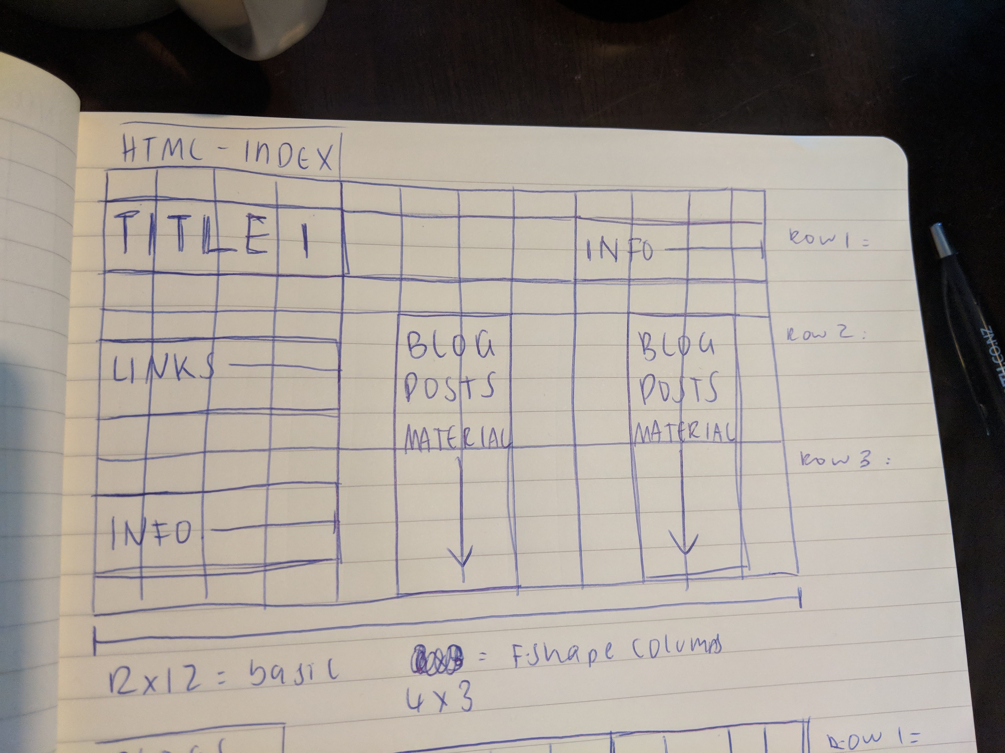
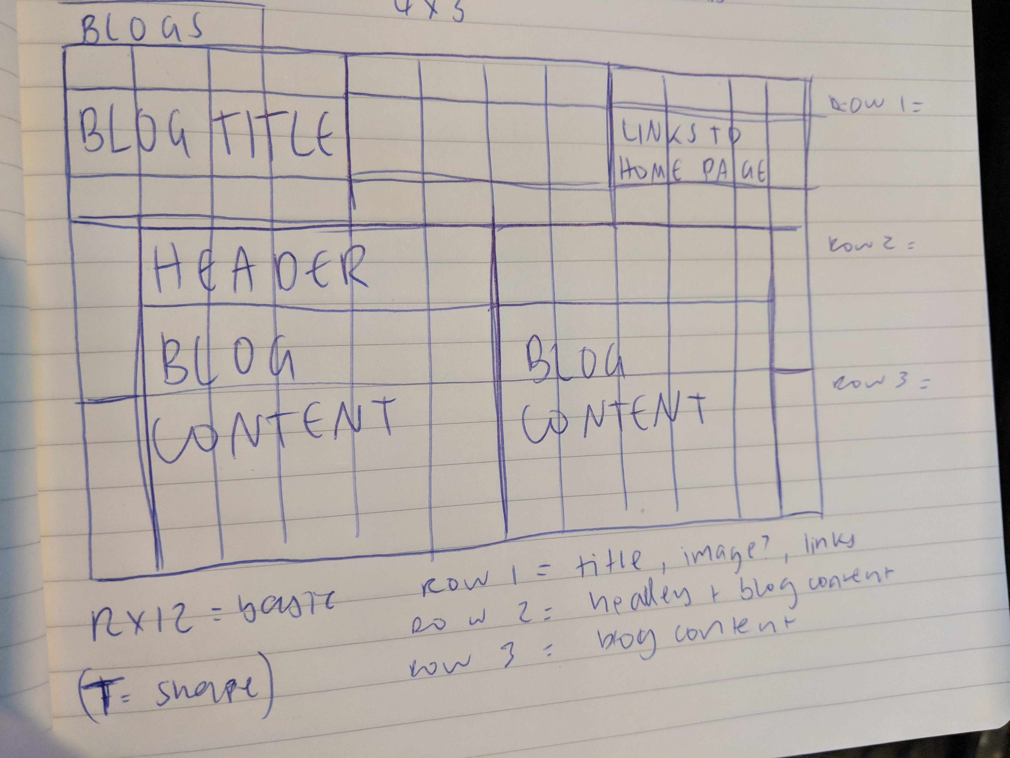
Here are some images from my first few sketches of my wireframe for the index and blog pages on the desktop.
This image here was the very first sketch of my blog page wireframe for a desktop (1200px). This obviously wasn't very ambitious, it was hard to get specific when I didn't want to make any promises with anything too complicated, since even until now I'm still figuring out what I'm capable of in terms of making things work. All of my sketches were done in the morning or early afternoon, so as you can imagine, a lot has changed in terms of redesigning since then. As I'm writing this, it's 11pm on Friday. :)
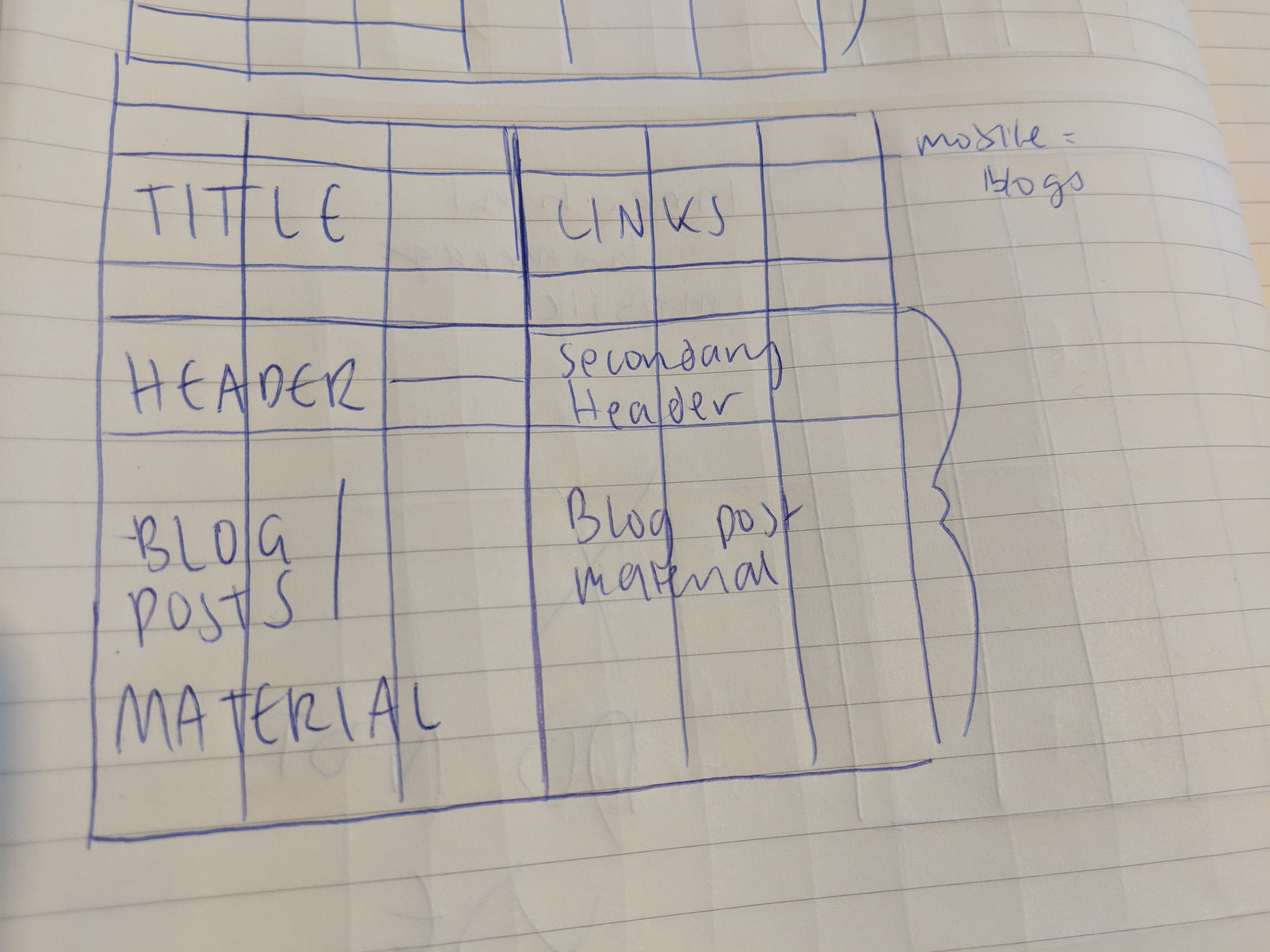
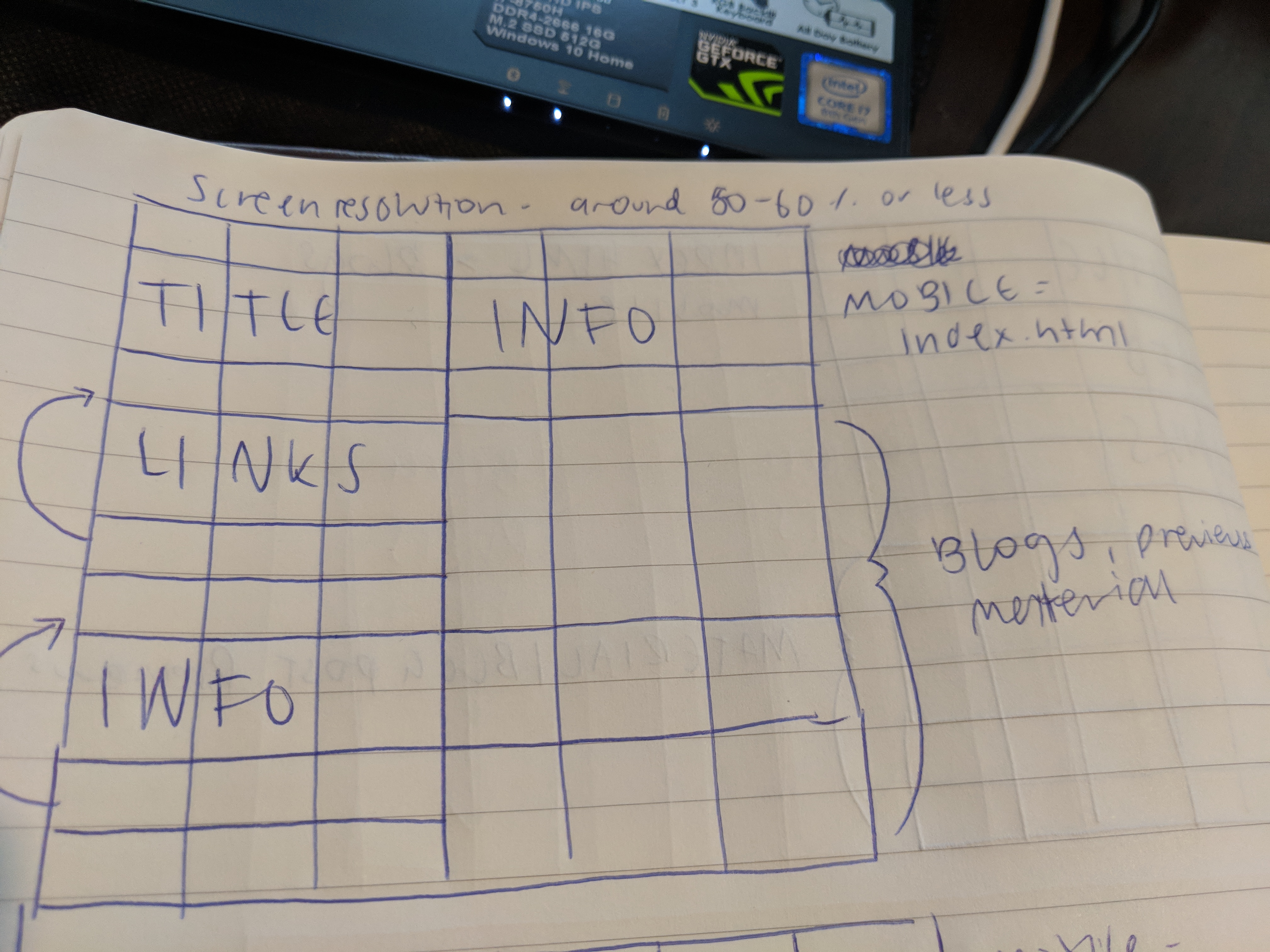
Here are some images from my first few sketches of my wireframe for the index and blog pages on the mobile.
This image here was the very first sketch of my blog page wireframe for a mobile display (for resolutions under 550px, that's the idea anyway). Again, they're not very ambitious or imaginative, I am still picking up ideas from websites along the way that I think will be possible, but at the moment I want to start small as to not get overwhelmed in the amount of work and research I'd have to delve into to get what I would actually want my site to do. That would probably consume most of my working hours, and in the long run it probably wouldn't be worth the effort. So for now, here's what I got. It's doable for the most part, and it's a simple yet effective design that's also achievable.